The Logo Mishaps of Giant Brands Even the world's most iconic brands make mistakes. Here are five giant company logos that now serve as giant cautionary tales.
By Tim Gray
Everybody makes branding mistakes. Early missteps in retrospect often are as big as the eventual names of some of the companies who made them -- Google was originally called Back Rub, Pepsi-Cola was known as Brad's Drink, and IBM started out as Computing Tabulating Recording Corporation, to name just a few.
And a company's logo is just as tricky and as important as its name. Your logo is the most powerful and immediately identifiable part of your brand. Properly done, a logo instantly communicates and reflects your company's personality. It also connects with your consumers. Done poorly, a logo can turn people off to your business and damage your reputation before you've had a chance to make your pitch.
But take heart, not everyone hits a homerun the first (or second or even third) time at the plate. Here are five iconic brands that did it their way, and then decided to do it another way.
Apple
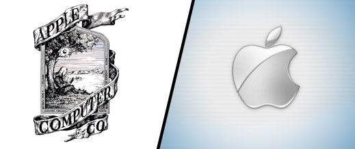
Apple's original logo was designed by co-founder Ronald Wayne and has a decidedly dull look and feel. The original logo is pretty much the antithesis of everything the company stands for today. In fact, the drawing of Isaac Newton sitting under an apple tree (complete with a William Wordsworth quote!) was not only ill-conceived but ultimately short lived. Within a year of founding the company in 1976, Steve Jobs demanded a redesign because he felt the logo was too intellectual and far too intricate to be stamped on computers.
The Gap

In business not everyone travels in the same direction. And that also holds true for logo design. In the 1990's clothing company, The Gap, hit upon what many to this day believe is one of the iconic logos of American fashion. So why in 2010 did the San Francisco-based clothing giant mess with success? According to reports at the time, company spokesperson Louise Callagy said the new logo was supposed to signify The Gap's transition from "classic, American design to modern, sexy, cool."
Of course, a new logo is a gamble. The Gap learned that lesson the hard way and reverted back to the old logo one week later.
Starbucks

Today's Starbucks' logo is as green as the eco-friendly company strives to be. But the coffee maker's brand wasn't always the color of money. In the early days the original Starbucks logo sported a brown woodcut illustration of a topless siren from Greek mythology. While that undoubtedly was fine back in the laidback 1970's Northwestern U.S., a semi-nude icon probably wasn't going to play well in the rest of America. In recent years the green, black and white logo has been significantly streamlined and the siren covered up. Starbucks' current version -- used since 1992 -- is much more conservative and contemporary.

In a little more than a decade Google has grown from afterthought search engine into a global brand worth more than Disney, McDonald's and Coca-Cola. It's hard to fathom now, but at one point in the late1990's Yahoo was the big player in the space. The now floundering company held such a dominant position it could afford to essentially lease out Google's algorithm as a backup for instances when the Yahoo search engine couldn't deliver immediate results to people's queries.
It might not be a stretch to say that the Google guys wanted to be a bit more Yahoo-like. Just check out an earlier version of their logo complete with exclamation point!
Nokia

Nokia was first founded in 1865 as a wood-pulp mill in southern Finland, and later in 1868 opened a second mill on Nokianvirta River, hence its name. After several years the mill was transformed into a share company, and ultimately evolved into one of the world's biggest telecommunications companies. Given the company's aquatic origin, it's no wonder in 1966 Nokia execs chose the image of a fish for its logo. However, cooler heads ultimately prevailed and the fish head logo was reasonably replaced with a more fitting image for a global company.
What do you think makes a hit logo? Leave a comment and let us know.


